
Home » Digital & Creative » Enhancing Your Brand’s Visual Identity: How to Design with Logo
Enhancing your brand’s visual identity is a significant part of branding, helping to create and communicate a brand’s personality and values. At the center of the branding process is the logo, a recognizable symbol that represents the brand across various contexts. This guide outlines a step-by-step approach to designing a logo enhancing your brand’s visual identity.
Quick Overview
A logo is a key element of brand visual identity, representing a brand’s values, mission, and personality. This guide outlines a step-by-step process for creating an effective logo that enhances brand recognition and trust.
What You’ll Learn:
✅ The role of visual identity: colours, typography, imagery, and logo styles.
✅ Types of logos: wordmark, lettermark, symbol, combination, and emblem.
✅ Key design principles: simplicity, memorability, versatility, and relevance.
✅ Logo creation steps: research, sketching, digital rendering, and feedback.
✅ Testing and finalising: ensuring adaptability across formats and media.
✅ Implementation: integrating the logo and creating brand guidelines.

Enhancing your brand’s visual identity consists of the visual elements that make up a brand for the consumer: name, emblem, visual features, and color scheme. It is the totality of everything that a brand communicates to consumers through its visual elements.
Logo: The logo is the focal point of enhancing your brand’s visual identity. It is a unique graphic mark or symbol that represents the brand and is instantly recognizable. A well-crafted logo can convey a great deal about the brand’s character and values in a single, powerful graphic.
Colour Palette: A set of colors that a brand uses to represent itself. Colors have a psychological impact on our minds and can trigger certain emotions or thoughts. For instance, the color blue can make people feel calm, whereas red can excite them. A color palette encourages a consistent look and feel across all brand materials and helps consumers remember a brand.
Typography: Consider the fonts and styles in which you present the text of your branding materials. You can use one or more typefaces in various weights and sizes, but the result will influence whether the brand is perceived as readable or harder to take in. Does it convey modern sleekness or traditional elegance?
Imagery: Imagery can include photographs, illustrations, or other visual elements. Imaging that is consistently used in a manner that supports the organization’s visual style and values reinforcing and enhancing your brand’s visual identity and helps tell the brand’s story.
Why is a cohesive visual identity so important? When all the parts of a brand work together to present a strong, recognizable brand image, that brand will be noticed. When visual brand assets are consistent across all brand channels, that brand will stick in the minds of people who see them. For a customer, the brand experience—whether it’s on Instagram, the website, or in printed materials—will feel familiar and trustworthy.

An example of a logo is a symbol or graphic mark that represents a brand. Its main function is to serve as a visual shorthand for the brand, making it easy for consumers to recognize and remember. A good logo is meant to capture the spirit of the brand in a way that communicates the values and mission of the brand and the qualities that make it different and unique, all in one visual symbol.
Wordmark: A wordmark is a logo that consists of the name of the brand spelled out in a specific font or style. It is a logo with an emphasis on typography, which creates a recognizable and distinctive identity. Examples include Google and Coca-Cola.
Lettermark: A lettermark is similar to a wordmark, but it forgoes the full brand name in favor of initials or abbreviations. This is a good option for long brand names. Example: IBM and HBO.
Iconic/Symbolic: An iconic/symbolic logo uses a simple image that is uniquely identifiable with the brand. The image often stands in for the brand, and the logo becomes synonymous with the brand itself. Examples include Apple’s Apple and Nike’s swoosh.
Combination Mark: A combination mark is a logo that features text and a symbol or icon. The advantage of this type of logo is that the text and the symbol can be used either together or separately. Examples include Adidas and Mastercard.
Emblem: A symbol that includes the brand’s name within an icon or image. The emblem logo creates a single, integrated design. It can look traditional or formal. Starbucks and Harley-Davidson are examples.
Essentially, the logo is the first touchpoint between a brand and its audience. It is a form of communication, and many times, the first one. It serves as a kind of ambassador for the brand, as it can communicate professionalism, reliability, and the personality of the brand. The logo can create an emotional connection between the audience and the brand; the right logo can change the perception of the brand. A clean, modern, sleek logo can communicate modernity, innovation, and forward-thinking. A classic, elegant logo might communicate tradition and reliability.

Firstly, a simple design is key to a good logo. A simple logo will be clear and memorable, even at a glance. By keeping it clean and avoiding excessive detail, the logo will be legible and not cluttered, making it more suitable for numerous different purposes.
A recognizable logo is an important part of how a company builds its brand identity. A great logo contains elements that are memorable and unusual so that the audience remembers seeing it and can recall the brand when they see it. This can be as simple as unusual typography, a creative icon, or an unusual color palette.
A good, adaptable logo should look good in many contexts and many sizes. So, it should work just as well on a business card, a website, or a billboard as on merchandise. Consider not only the color version of the logo but also how it could look in black and white to maintain the impact of the mark if reproduced on a photocopier, for instance. An adaptable logo works in many contexts, but it remains an identifiable logo.
The logo should reflect the brand’s values and industry while also speaking to and engaging with the appropriate audience. The design should reflect the brand’s mission, values, and personality while meeting the preferences and expectations of the target audience. If the brand’s logo and visuals fit and are relevant to its industry, then it engages the appropriate audience.

You’re likely to begin this process by examining your competitors and the industry in which you operate. Suppose you’re designing a logo for a new venture. In that case, industry research will provide insight into market conditions and should give you a sense of what works (and what doesn’t). Studying design websites, branding books, and real-world examples will help give you a sense of what’s out there and inspire you.
Secondly, before creating the visual elements of the logo, it is important to define the brand’s mission, values, and personality. This is because these attributes are the starting point for creating a logo that really represents the brand. The tone of voice and brand identity will then translate into visual elements such as colors, shapes, and fonts. For will likely opt for modern, sleek elements, while an organic food brand will go for deep, earthy tones and natural shapes.
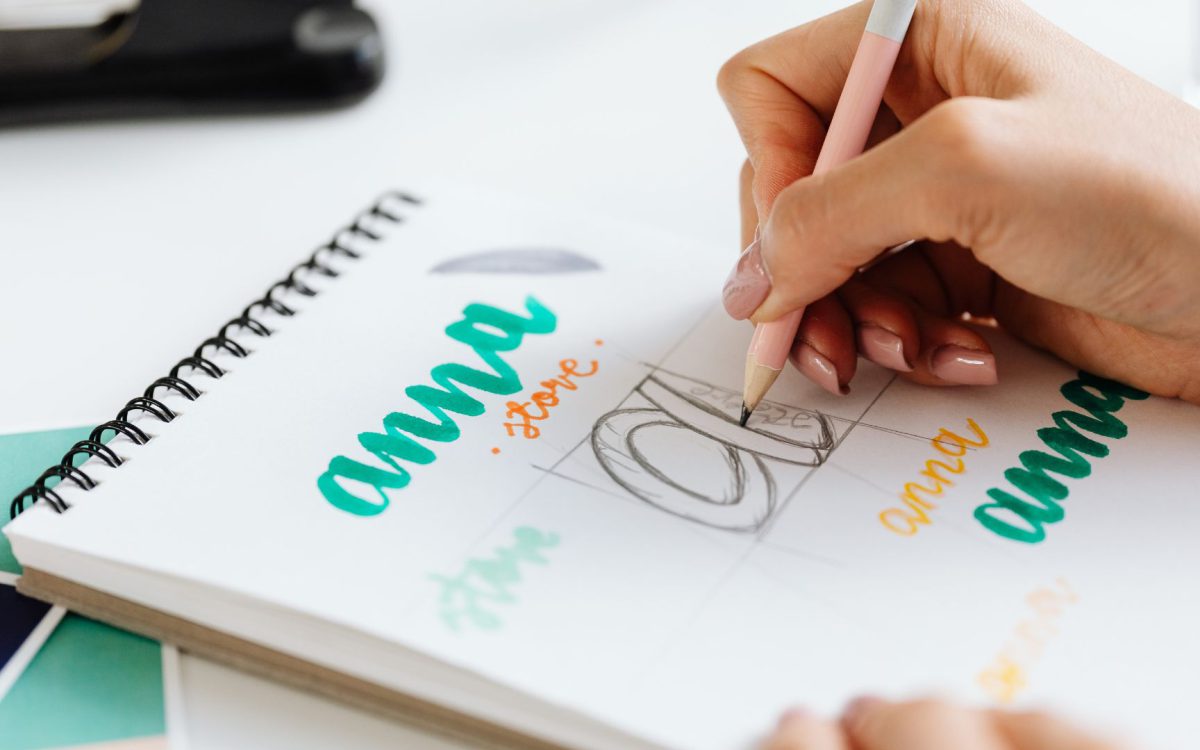
Brainstorm your ideas, sketch them out as thumbnails, and start to explore your initial ideas and variations. It’s not about perfection at this stage—it’s about quantity. Even with a basic understanding of drawing techniques, you can sketch your ideas quickly and identify the direction you’d like to take from there. It’s important to experiment at this stage; visualize different styles, compositions, and ideas, and see which one resonates with you the most.
The next step is to create a digital version of the sketches. I use design software to refine the chosen concepts and make adjustments to improve their readability and impact. With digital rendering, I have full control over elements such as color, typography, and alignment. Iterating on the design in a digital environment enables me to finalize the logo.
It’s important to get feedback from the stakeholders and the target audience to see how the logo design is working and if it is communicating the brand message effectively. The feedback received can be used to revise the log design until it is polished enough to be used effectively.

Interpreting the meaning of colors, their associations, and how they affect perception is a key aspect of logo design. Colors provoke feelings and associations, and a good color palette can greatly heighten and enhancing your brand’s visual identity. Blue, for instance, is most commonly interpreted as a color that denotes trust and professionalism, so it is often used by corporate brands. Green, on the other hand, suggests growth and health, making it a great fit for eco-friendly or health-related brands.
When choosing your color palette, use the same approach as above, but think about what the colors you pick say about your brand. The colors should reflect the values and personality of your brand and the industry you’re in. It would be preferable that the colors you pick also strike a chord with your target audience. Using the same colors across all your branding assets can help people recognize that enhancing your brand’s visual identity is consistent throughout.
When it comes to fonts, you need to ensure that they match the rest of the design. The typography must be in line with the brand’s personality: it must be modern and sleek for tech companies, classic and elegant for luxury brands, or fun and crazy for kids’ brands.
These are all important for readability. Fonts should be legible in all sizes and printed on all media. Typography should be consistent across all branding elements, which helps to solidify and enhancing your brand’s visual identity.
To add a little more punch, consider using meaningful symbols that expand on the logo’s meaning. A good example is the Target bullseye, which has come to convey the brand’s commitment to making the shopping experience easier. Symbols can also communicate in enhancing your brand’s visual identity and make the logo more memorable. But be careful not to use a symbol that’s overused or clichéd, as that can make the logo look generic. Instead, look for something that adds something original and relevant to the brand’s distinctive personality and product category.

After our design is complete, testing how the logo will appear in different sizes and formats is a key step. A winning logo will look great on a business card and at the top of a 100-foot billboard. It is also important to make sure your logo looks good in both color and black-and-white formats.
This principle of legibility and clarity applies to the range of contexts in which the logo will be used. To stand a chance of enduring, the logo has to be easily legible and recognizable on diverse devices. Versatility is how the logo works.
If you want to hear a professional opinion, ask a design professional or consultant for advice. A professional designer has the expertise to comment on the balance of the image, the harmony of the color, and the typography.
Finally, feedback from experts can help refine the logo for its final tweaks and polish. A feedback loop completes this process, ensuring that the logo is polished, professional, and ready for launch.
A final review with all the stakeholders provides a last opportunity to make sure all parties are comfortable with the logo. A collaborative approach to creating a logo eliminates any last-minute surprises. It reinforces that the logo is an integral part of a brand’s vision and goals.
The last step is to obtain formal approval before launching the logo. Once all the stakeholders have given their approval, the logo is ready to be incorporated into enhancing your brand’s visual identity.

By applying the logo uniformly across all brand touchpoints—the website, social media accounts, marketing materials, packaging, signage, and merchandise—you will have reinforced the visual representation of your brand and contributed to its recognition and trust.
Keeping a record of the rules and guidelines for logo use ensures that every person involved in creating and using branded materials adheres to the same standards. Brand guidelines should have specifications for the size and spacing of the logo, color variations, and examples of how the logo should not be used. This helps to keep the logo consistent across all mediums and maintains the integrity of its visual identity.
A good logo is vital to building and enhancing your brand’s visual identity and impression on the audience. By taking the time to design the logo and ensuring it reflects the brand’s values, we can create a strong and unforgettable logo that effectively represents the brand. Using the logo consistently and evolving its design as the brand grows and changes will also ensure that the visual identity is always fresh and appealing.